
What makes a brand
feel premium?
If there were a formula for making a brand feel premium, we’d all have it by now.
As designers, we have our tricks. Make the logo smaller. Add a generous amount of nothing. Keep it black and white. Very sophisticated. And sometimes, exactly what everyone else in the category is doing.
That’s where it gets interesting. Premium has a lot to do with rarity and exclusivity. So if everyone around you looks equally expensive, how exclusive does that really feel? We have to look at the competition, the context, and the people we’re trying to reach.
Premium compared with what?
Imagine a law firm with a beautifully typeset name, quiet colors, and expensive-looking photography. Now put it beside six competitors with beautifully typeset names, quiet colors, and expensive-looking photography.
Everything looks expensive. Everything also looks remarkably similar.
Premium often comes with a sense that you’ve found something you won’t get everywhere else. The familiar luxury cues can help, but when the whole category is using them, they lose some of that power. You have to stay alert to what’s become ordinary in your space.
That doesn’t mean your law firm needs to look like a cocktail bar. Or maybe it does. We often borrow from adjacent industries to build a world around a brand. A little hospitality in a category that could use some warmth, for example. That’s world-building, and it deserves a Note of its own.
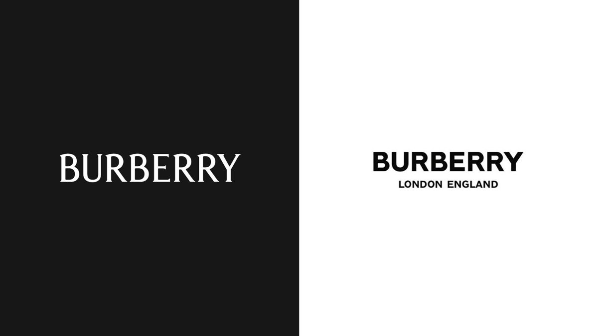
Even luxury brands change the visual language. Burberry replaced its serif wordmark with a bold sans serif in 2018. In 2023, it introduced another wordmark alongside a refreshed Equestrian Knight Design. Those choices belong to particular creative directions; they aren’t universal instructions for looking expensive.
What’s happening around the logo?
Picture a tied trash bag on the curb. You probably know what happens next.
Now imagine the same bag in the middle of a white gallery, carefully lit, with a small label beside it. You might stop and look. You might wonder what it means. You might wonder whether you’re allowed to touch it.
The bag hasn’t changed. The room has given you a different way to read it.
 Illustrative scene

On the curb, you’re probably waiting for someone to take it away.
Brands work in context too. Photography, materials, language, the website, the place something is sold: all of it helps people decide what they’re looking at. Even a price creates an expectation, although the experience still has to earn it.
A quieter identity might rely on remarkable photography. An unusual identity might feel considered because every surrounding detail is so well resolved. There’s more than one way to make the whole thing convincing.
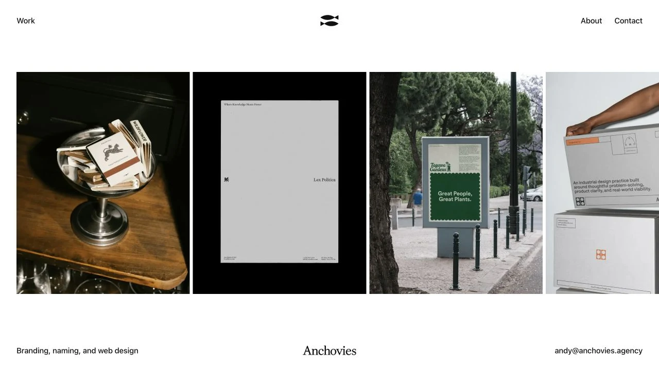
When we renamed the agency Anchovies, my friends thought it was the worst idea ever. You’re naming your agency after that gross little fish nobody likes? Pretty much, yes.
I wanted the agency itself to show how much we believe in differentiation. Agencies can be surprisingly bad at branding themselves. And we believe you don’t have to be for everyone. Anchovies felt like a fairly efficient way to make that point.
Then put that name beside contemporary typography, a clean website, and carefully presented work. The tension is what makes it interesting. You bring one set of associations to the name, and the experience gives you another. Everything around it helps you understand what kind of agency we are.
Whose idea of premium?
Look at DedCool’s logo. A roughly drawn name and a barcode. The thing you scan at checkout. Not exactly the usual shorthand for luxury.
And yet its 32 oz. Milk Dedtergent is $35 at the time of writing. Expensive laundry detergent. The logo hasn’t made a mistake. It’s speaking to a different idea of premium: fragrance, personal taste, and a brand you want on the shelf.
 Logo: DedCool ↗
For someone drawn to that world, those cues can feel more desirable than traditional luxury packaging. That’s the point: premium has to mean something to the person looking at it.
Gen Z isn’t one taste profile, either. Look at the brands, places, music, and objects your audience cares about. Their idea of expensive might look nothing like yours.
Before making the logo any smaller
Put your brand beside the alternatives your customers actually consider. Then look at the full experience, from the first photograph to the first conversation.
Does it give the right people a reason to want this one? Does it feel like something only your business could offer? Does the quality of the experience support the impression?
That’s the work. The space around the logo is one part of it.