
How do you know if a brand identity is good?
It looks good. Is it any good?
That’s the slightly harder question. A new identity can look beautiful in a presentation. But while we’re making it, how do we know it’s actually right for the business?
We keep coming back to five things. Is it different? Is it appropriate? Is it simple? Is there something interesting enough to share? And, yes, does the client like it?
They sound fairly straightforward until you try to make them all work together.
Is it different?
Differentiation is the first thing we’re looking for. On a shelf, on a screen, in a row of competitors, can someone tell you apart before they’ve read every review and learned your entire life story?
That’s a lot of what an identity is there to do. Give someone a reason to pause. This one looks different. There might be something here.
So we look at the market. What does everyone else look like? What have people come to expect? Where’s an opening? The answer changes from a crowded consumer category to a local service business. Different is always relative to something.
There’s an exception. Sometimes a category is full of half-finished versions of a perfectly good idea. You can see what everyone was trying to do. In that case, the opportunity might be to do it really damn well. You don’t have to invent an entirely new aesthetic if nobody has properly delivered the one that makes sense.
Is it appropriate?
Standing out is the easy part if you’re willing to do absolutely anything. Making it different and right for the people you want to reach is where the work gets interesting.
We’re thinking about their taste, their expectations, the culture around them, and what they need to feel about the business. What feels reassuring? What feels exciting? What might suggest the wrong price, the wrong experience, or the wrong company altogether?
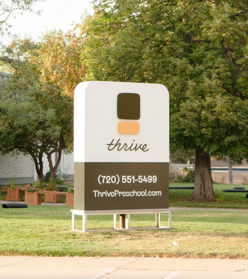
With Thrive, the children weren’t the ones paying tuition. A lot of preschool branding looks like the children made it. We wanted the illustrations to feel closer to simplified modern art than finger paint, giving the school a more artful, boutique feel that made sense to parents at a higher price point. Even the logo was an abstract, almost monolithic mark. Playful didn’t have to mean childish.
Appropriate doesn’t have to mean familiar in every way. Sometimes the interesting move is to stretch what people expect. How far depends on the audience, the idea and how much uncertainty the business can comfortably take on. We’re looking for a useful connection, even when the execution is unexpected.
Is it simple?
Get really good at hitting delete.
A lot of overdesigning comes from wondering whether we’ve done enough. One more graphic. One more message. One more thing to prove we know what we’re doing. Simplicity takes a certain amount of confidence.
It also puts more pressure on what remains. If there are only a few elements, they need to work hard, graphically or conceptually. We’re trying to arrive at the strongest idea, clearly expressed, so someone doesn’t have to untangle it.
And yes, sometimes the whole point is to be gloriously maximalist. That can work too. The question is whether the complexity is doing a job, or whether we just haven’t stopped adding things.
Is it interesting enough to share?
Here’s a question I ask myself throughout a project: would this be a case study someone would want to pick up?
What would the story sound like? What would someone find interesting enough to write about, send to a friend, or stop scrolling for?
That’s a useful early test. If all I can say is that we chose a nice typeface and some colors, I probably need to keep thinking. What’s the idea? What makes this worth paying attention to?
I’m not talking about designing a stunt for other designers. The interesting thing should have something to do with the business. Press isn’t guaranteed, and it doesn’t prove an identity is commercially successful. But asking whether there’s a story worth sharing keeps us honest about how much of an idea we actually have.
And does the client like it?
The one that can make a room full of designers a little nervous.
For a while, I thought this was almost beside the point. If we’d made something different, appropriate and simple, and it solved the business problem, surely that was what mattered.
Over time, I’ve become more empathetic about it. This is someone’s business. They’re the person walking past the logo on the window every morning. They should feel proud of it. Being a good creative director means caring about that too.
But the client isn’t always their own ideal customer. Some of the most thoughtful entrepreneurs I’ve worked with can separate what they personally like from what the people they serve will respond to. Sometimes those things overlap. Sometimes they don’t.
So we make room for taste without letting it be the only thing in the room. A founder loving the identity is a good thing. A founder loving it while the intended audience doesn’t understand it is something else entirely.
The balance is the job.
These aren’t five boxes we tick and then declare victory. They pull on one another.
A direction might be very different and a little less familiar. Another might be extremely simple, with its distinction coming from how well it’s executed. A client might need time with an idea before they feel the pride we’re hoping for.
That’s why we keep looking at the combination. Turn one thing up, and you may need to reconsider something else.
There isn’t one setting for every business.
Good for what?
All of this needs to come back to the business. Are we trying to attract a different kind of customer? Support a higher price? Give a new company something people will remember?
Before launch, those five questions help us judge whether the identity has a good chance of doing that job. After launch, we need to look at what actually happens. The presentation can’t tell us that part yet.
I have taste. Of course I do. But the job is to understand the people and the business well enough to make something right for them. Then we can ask a much more useful question than whether we like the logo.